One of the main things that plays a pivotal role in attracting customers and retaining visitors to your website is the UX.
UX, or user experience, refers to how a person feels and interacts with a website or web application. It encompasses all aspects of the user’s experience, including their emotions, perceptions, and interactions with the website’s design, content, and functionality.
A seamless and engaging UX not only ensures user satisfaction but also boosts conversion rates and keeps users coming back for more.
In this blog post, we will explore some effective strategies that can help enhance your website’s UX and create a delightful online experience for your visitors.
1. Use of white space
A web page’s “white space”, or “negative space”, refers to the empty space between and around elements. Generally speaking, white space is the absence of content or visual elements and can be of any color, not just white.
It’s a purposeful and powerful design element that contributes to the clarity, aesthetics, and usability of a design. It can greatly improve the user experience by making content more scannable, understandable, and visually appealing.
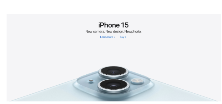
Apple employs white space strategically in its website UX to create a clean and minimalist design.
2. Prioritize Loading Speed
The speed of a page plays a big role in user satisfaction and retention. Slow-loading pages frustrate users, leading to high bounce rates and abandonment. Fast-loading pages on the other hand, enhance engagement, lower bounce rates, and improve conversion rates.
Search engines also favor faster websites, improving their SEO rankings and discoverability. Ultimately, focusing on website speed signals a commitment to fostering positive brand perceptions, driving business success, and providing users with an efficient online experience.
3. Embrace Mobile-First Design
Increasing smartphone usage makes mobile-friendly design a top strategy for enhancing website UX. In a mobile-responsive site, the content adapts seamlessly to different screen sizes, such as mobile phones and tablets, improving accessibility and readability.
Having a mobile-first UX can help you attract a broader audience, provide a consistent and user-friendly experience, and increase conversions, increasing the overall effectiveness of your website.
Here are some key aspects of mobile-friendly design:
- Responsive Layout: A responsive layout ensures that the website adapts to different screen sizes and orientations, providing an optimal viewing experience for users.
- Compressed website content: Compressing videos and images reduces their file size without significantly impacting their quality, resulting in faster loading times for mobile users
- HTML5 instead of Adobe Flash: Mobile devices do not support Adobe Flash, so using HTML5 for multimedia content ensures compatibility and a better user experience.
- Avoid Pop-ups: Pop-ups can be disruptive and difficult to close on mobile devices, so it’s best to avoid them or use subtle implementations that do not interfere with the user’s browsing experience
- Mobile-specific Features: Mobile-friendly websites should include features that are specific to mobile devices, such as click-to-call buttons and easy-to-use navigation menus
BuzzFeed’s mobile website offers a smooth and engaging experience for users, with easy-to-read content, interactive quizzes, and shareable social media buttons.
4. Content organization and clarity
Well-structured content marked by clear headings, bullet points, and whitespace aids users in swiftly digesting information. When navigation is simplified, users can easily find what they need.
A logical content sequence and intuitive layout guide users through their journey, encouraging control and comprehension. A website that prioritizes content organization and clarity caters to its users’ needs and provides a more pleasant browsing experience for users, ultimately leading to higher engagement, a lower bounce rate, and an improved overall user experience.
5. Optimize readability
Clear fonts, appropriate sizes, and high-contrast text-background combos make content easier to read. Having better readability makes information easier to comprehend and navigate, boosting the overall user experience.
The more easily users can consume content, the longer they will stay on a website, and the more likely they are to engage with it. This also results in more satisfied users, further enhancing your online presence.
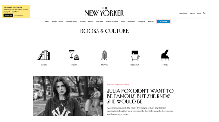
The New Yorker’s clean and elegant design focuses on typography, making it easy for readers to navigate and consume content.
6. Providing engaging content
Providing engaging content captivates users, encourages them to explore further, and they will therefore stay longer on the site. Users stay interested and informed when you have compelling headlines and visuals. Incorporate interactive elements such as videos, voiceovers, games, polls, surveys, quizzes, and ebooks.
When you have engaging content, you position your website as a reputable source of information or entertainment, building trust and loyalty. Basically, engaging content creates a memorable and enjoyable user experience, leading to increased user satisfaction and retention.
7. Clear Calls to Action (CTAs)
Clear Calls to Action (CTAs) provide direction to users, guiding them on desired actions such as signing up, making a purchase, starting a live chat, or contacting the business. Straightforward CTAs ensure users understand what’s expected of them, reducing confusion and frustration, making the user journey faster and more efficient.
A prominent and clear call-to-action empowers users, allowing them to navigate the site with confidence. It also increases conversion rates, enhances user experience, and contributes to the website’s effectiveness.
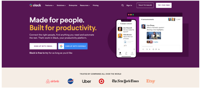
Slack’s website features a simple and straightforward CTA prominently displayed and encourages users to sign up for their ‘free to try’ team communication platform.
8. Establish Feedback Loops
Encourage users to provide feedback or report issues as this demonstrates responsiveness and a commitment to user satisfaction. By having two-way communication, usability problems can be uncovered and fixed in time. Whenever users feel valued and heard, they’re more likely to stay engaged and loyal.
Additionally, feedback loops offer insight into user preferences and pain points, allowing you to tailor website improvements. Using this iterative approach, a website offers a more satisfying experience, which results in higher user satisfaction, greater engagement, and a stronger presence online.
Conclusion
Enhancing your website’s user experience is an ongoing journey that demands dedication and user-centricity. By implementing these comprehensive strategies, you’ll create a website that’s not only attractive but also offers your visitors an enjoyable experience.
UX is not a one-time endeavor; it’s a continuous commitment to providing the best possible experience for your users. Remember, a user-friendly website isn’t just a digital asset; it’s the gateway to building lasting connections with your audience and achieving your online goals.


