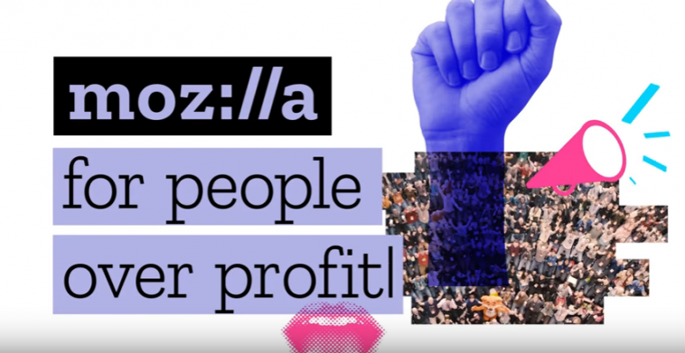
Mozilla’s flagship Firefox browser is about to be restored with a brand new engine version. After a few setbacks due to some wrong decisions on its part, Mozilla seems to be catching up now. It has decided to revamp the system with the aim of marking a radical break with its old brand identity.
The organization has stated that the latest Mozilla logo is inspired the way URLs are formed (moz://a). The logo is a signal to URL language support that internet is crucial for Mozilla.
Latest logo’s font which is the Zilla font is available free of any cost but under an open source license. It has been designed by Typotheque which is also known as the one to release web-based fonts in early ages of the internet.
Although there was no ominous requirement for a new logo but interestingly it actually focuses completely on the web and on the central mission of the organization. Previously Mozilla was thought to have forgotten the actual purpose of its establishment especially when it started pursuing the mobile OS market. It’s the benefit of Mozilla of being a nonprofit organization that keeps competitors honest and open. Although Mozilla failed to retain the market share it once had but with Firefox operating as an important part of the open web ecosystem, we can hope for it to rise again sometimes in the near future.
Via: Tech Crunch


