

 Hajra Naz
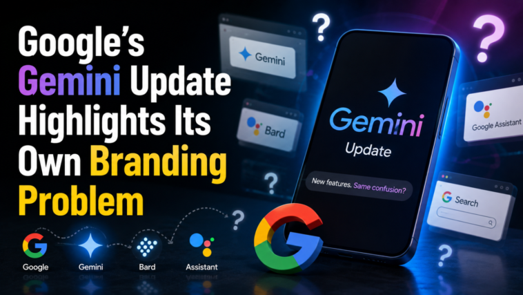
Google made a smart point in its Wednesday announcement about new Gemini Live voice features. The company said users shouldn’t have to guess whether a task needs Spark, a Daily Brief, or a simple inbox search. That’s the promise Google is making. The updated Gemini app is supposed to handle many tasks through voice commands alone.
But there’s an irony buried in that statement. Google has slapped its own brand name on nearly every Gemini AI feature. That habit works against the very message Google just made.

Too Many Icons, Too Little Clarity
Inside the Gemini app, users can switch between chat, Spark, and Daily Brief. These are three separate features. Each one gets its own icon. Each one has its own spot in the app’s navigation. This setup clutters an experience that could otherwise feel simple. It also hints at a deeper issue. Gemini still hasn’t landed on one standout feature that ties everything together.
Daily Brief Feels Built for Engineers, Not Regular Users
Daily Brief is a good example of this problem. It reads like something an AI engineer would find clever. A regular user might not feel the same way. The feature acts like an AI-powered agenda. It promises “proactive, personalized updates.” These updates pull data from Google apps like Gmail and Calendar.
In practice, the feature struggles with basic judgment. It can’t separate urgent, actionable information from random nudges. Sometimes it prompts you to continue research you started in the chatbot. Other times, it resurfaces old Google searches you made in the past.
That second behavior doesn’t feel helpful. It feels unsettling. Imagine researching college scholarships or animal rescue groups on Google. That doesn’t mean you want an AI bringing it up again later. Nobody asked for that follow-up.
Read More: How to Use Google Gemini from Your iPhone Locked Screen Easily
Spark Is Useful, But Overbranded
Spark has the opposite issue. It’s genuinely one of the more useful parts of the Gemini app. It’s an AI agent that can take action on your behalf. But Google turned it into its own standalone brand. That branding isn’t necessary.
Google’s engineers might enjoy being part of an internal “Spark team.” That’s fine on the inside. But an everyday app user shouldn’t need to think about that. Nobody wants to figure out which “side” of an AI app fits their task. Users should just type what they need. The AI should handle the rest, launching an agent only when the task actually requires one.
This Problem Goes Beyond Gemini
To be fair, this issue isn’t unique to Google. Much of the AI industry exposes its internal structure directly to users. Instead of hiding complexity behind a simple interface, companies put it on display.
Right now, people have to decide whether to “chat” with Anthropic’s Claude or use “Cowork” instead. Until this week, those two modes inside the Claude app didn’t even share memory of past conversations. ChatGPT works the same way. Users must switch between “Chat” and “Work.” This kind of engineering-first design makes AI feel unnatural to use. Everyday consumers end up learning brand names for what are really just different interaction modes.
Apple’s Quiet Approach May Be Smarter
This may explain why Apple’s low-key approach to Siri could win people over in the long run. Some called Apple’s fix for Siri anticlimactic. But Apple users don’t need to change any of their habits to benefit from it. Apple made existing tools smarter. Spotlight Search got smarter. The Photos app got smarter. The iPhone camera got smarter. Siri voice requests got smarter too. None of it required learning a new interface.
Read More: Google Moves Its A2A Agent Protocol Under the Agentic AI Foundation
Why Text-Based AI Assistants Are Gaining Ground
This same idea might explain why text-based AI services are growing in popularity. Services like Poke, Ollie, Lindy, Orchid, Lucas, Folk, Tomo, and Instinct all work the same simple way. Users text a chatbot. The assistant does what’s asked. There’s no app to navigate and no feature to choose.
Text messaging is already a clean, familiar interface. People understand it instantly. It doesn’t demand extra mental effort to figure out which button or feature applies to your task.
The Case for a Simpler Interface
a16z investment partner Justine Moore made this point recently. She wrote that people don’t want to open an app every time they need help. Instead, they want something they can text like a friend. She called iMessage the gold standard for this kind of interaction.